PowerBlock
Intro
Maximum Gains, Digital Pains
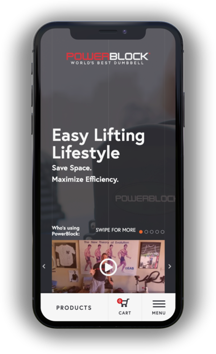
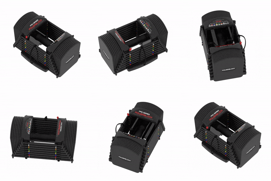
PowerBlock makes adjustable dumbells and other weight lifting equipment that saves weightlifters from having to fill up their house with clutter. The dumbells feature a sleek mechanism that lets users easily alter how heavy the dumbells are, making working out a much more convenient experience. As elegant as the product is, PowerBlock’s online presense did very little to reinforce the premium nature of their product line.
Their website was dated, featuring an intimidatingly oiled-up muscle-y aesthetic of the early 80s, and the ecom functionality was lacking. Unsurprisingly, PowerBlock’s brand wasn’t resonating with today’s health-conscious audience, and the site’s ecommerce flow wasn’t building much trust with the users, leaving dollars on the table and PowerBlock looking to us for help.
My impact at a glance:
💫 Brand Reformation
I built a brand identity designed to attract and delight today’s users.
🤑 Better Purchase Experience
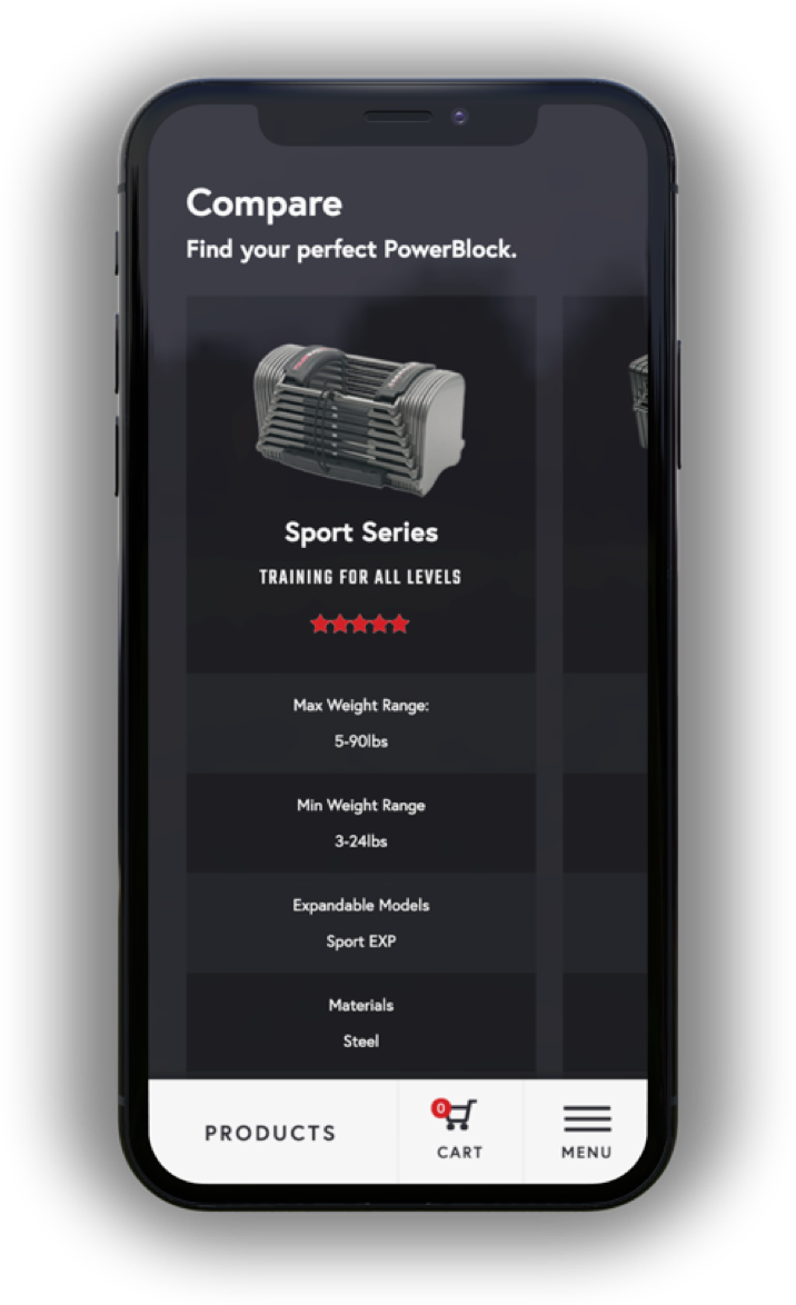
Finding and buying the right PowerBlock became just as easy as using the product.
🙌 Established Trust
We brought reviews, product explanations, and influencers to the forefront, building trust at first glance.


Branding
Find your Power
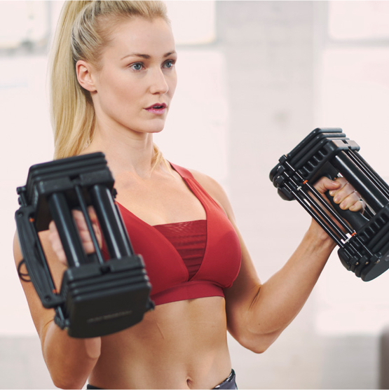
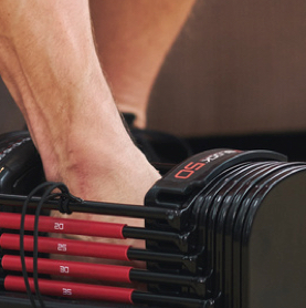
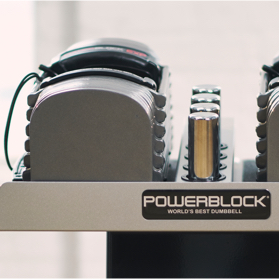
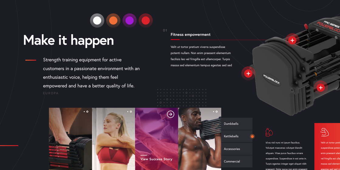
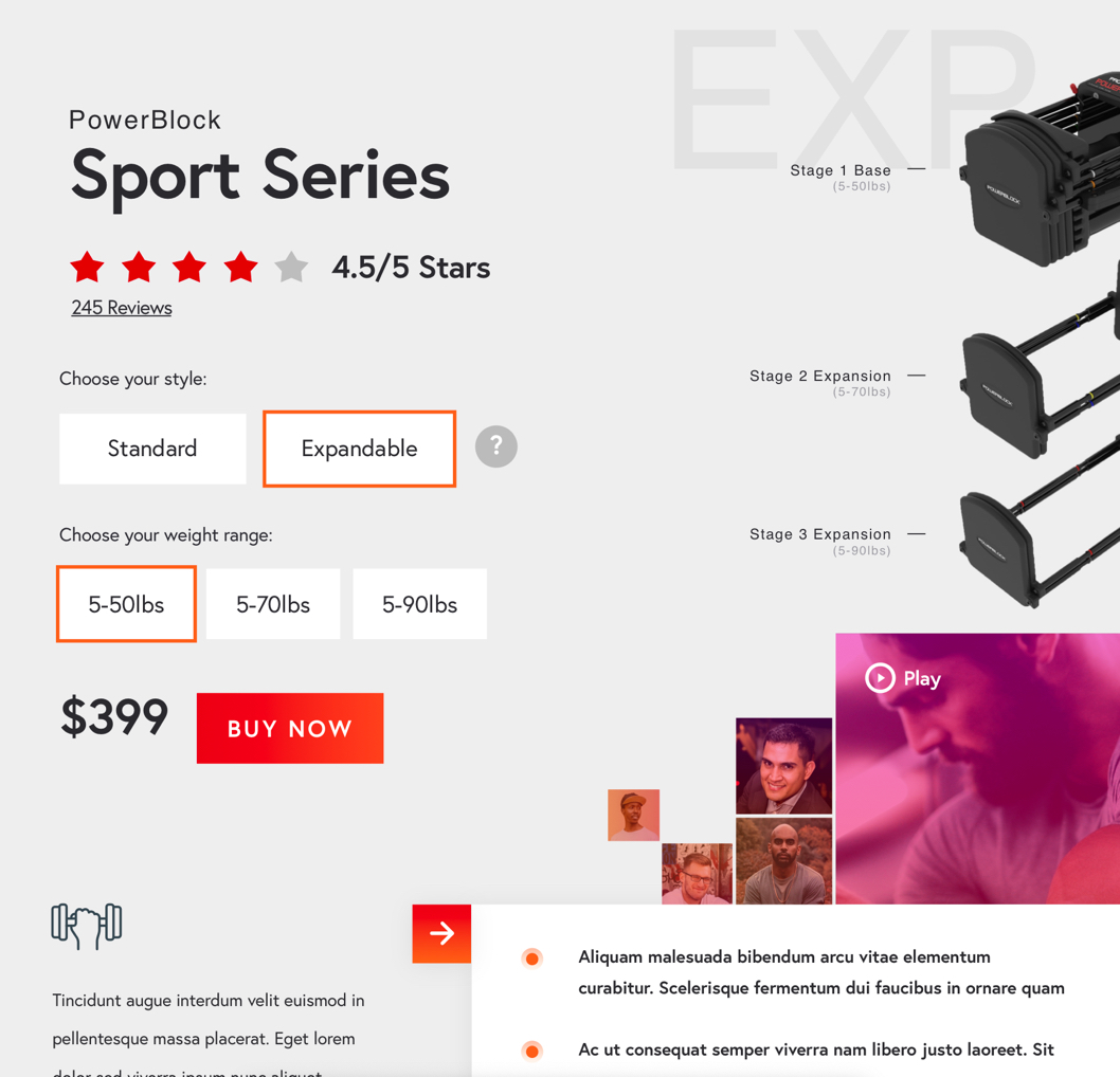
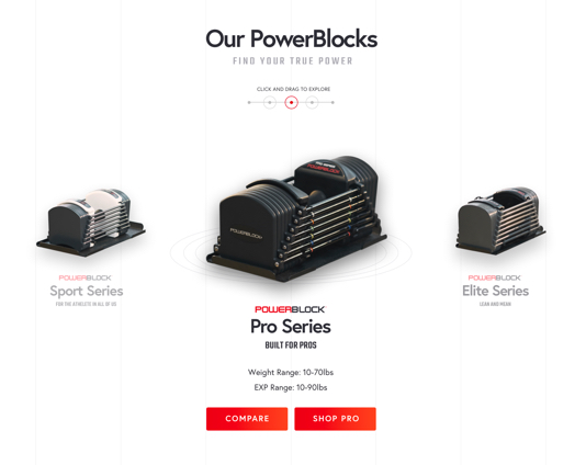
PowerBlock needed a look that would excite and invigorate today’s active athletes and set them apart from their competitors. Bold color gradients, sharp contrasts, and simple typography were the keys to our success.
UX Strategy
Teach the users well
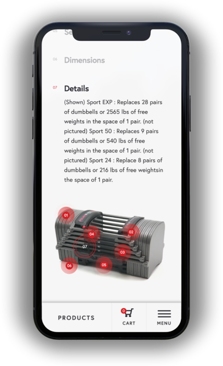
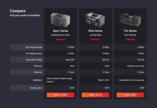
One of the biggest problems PowerBlock faced was that users didn’t really understand their product. PowerBlock’s staff spent a large amount of time answering questions over the phone and through email, and users were ultimately not making the purchase. When we started the project, we knew that we’d have to focus on education and product simplicity.
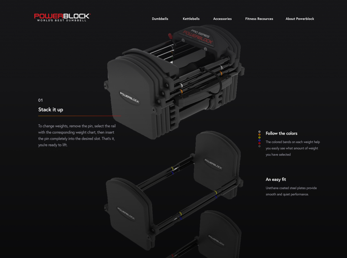
A concept for Phase 2 of the project
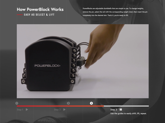
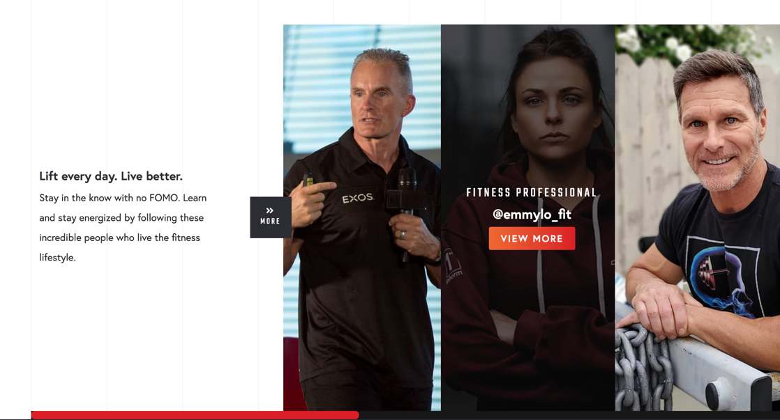
Influencers play a big part in teaching about and selling the product
