MGK
Introduction
See. Solve. Protect.
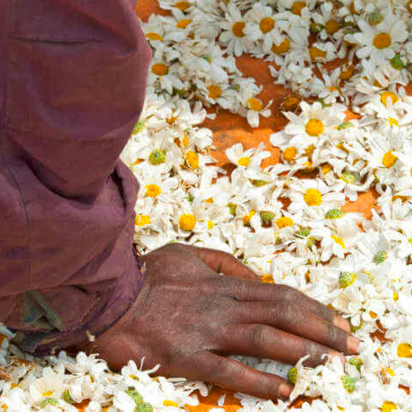
MGK is a company that’s dedicated to creating products meant to control pest populations in a variety of scenarios and applications. They had been operating with a site that was incredibly outdated and neglected to showcase the breadth and depth of what MGK was offering.
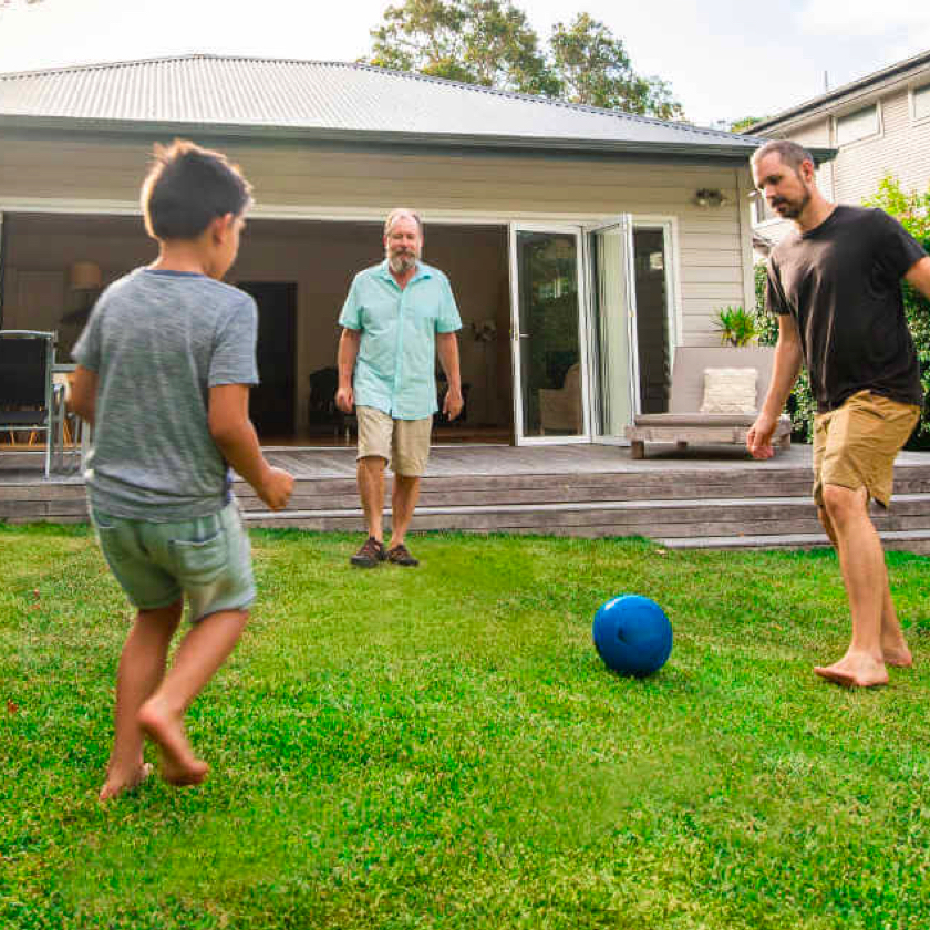
What made this particular website challenging was the sheer amount of business sectors that needed representation. From B2B ingredient purchasers and consumer buyers, to workers in the field applying their product, the site needed to cater to everyone.
My impact at a glance
💅 A brand makeover
In the competetive and scrutinized pesticide market, MGK needed an image of trust, reliabiltiy, transparency, and humanity.
🤯 4X more qualified leads
Believe it or not, the client told us they considered turning off forms because they were up to their eyeballs in leads. This is the best problem to have.
🚀 Traffic-driving content strategy
Through understanding their audience’s needs, we were able to craft a strategy that turned MGK into a major resource for all things insect.
Audience
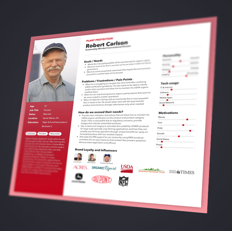
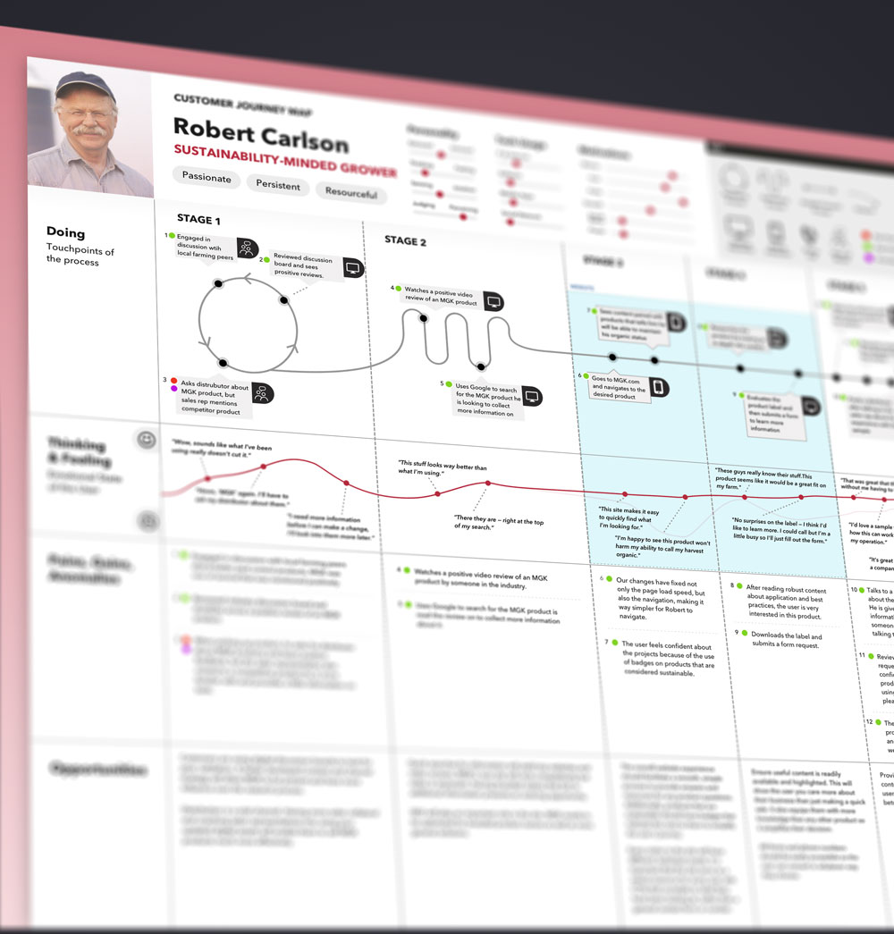
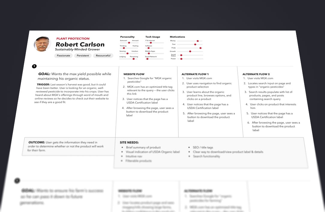
Many users, many perspectives
In order to even come up with a design solution for the client, we needed to run a lengthy and informative discovery process wherein we could learn who the users are, how they engage with the client, and ultimately how they could best be served with the new site. All of this sounds pretty normal, but the sheer amount of user groups made this a pretty large endeavor. After multiple interviews with different users, and running user tests on the current site, we were able to discern many different unique goals for the entire group, giving us a clear path to success.

Branding
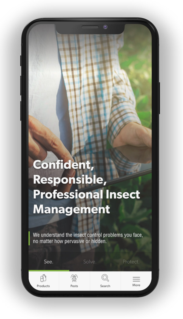
“Confident, Responsible, Professional Insect Management”
MGK came to us with an overall message that they wanted to be perceived as more personable and trustworthy. Another agency was coming up with the written language for how to communicate that feeling, and it was up to my team and I to create a visual identity to display that language. In order to get all of the necessary stakeholders on board, we ran an exercise consisting of 3 design concepts.
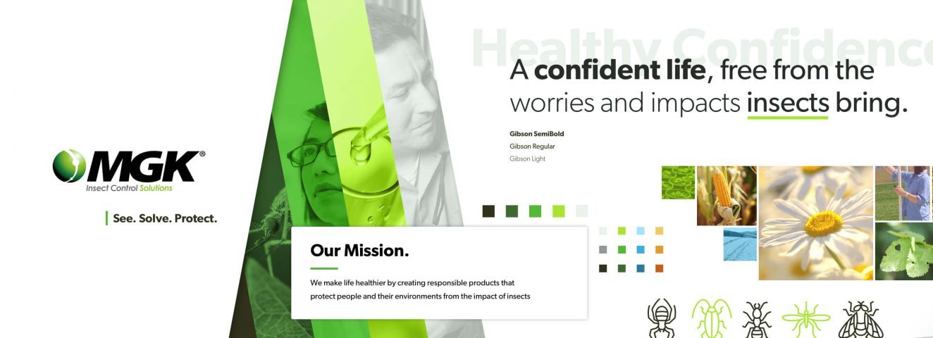
Of these three concepts, the stakeholders and our team reached a concensus that the last one was going to be the main direction of MGKs identity.
UX + Content
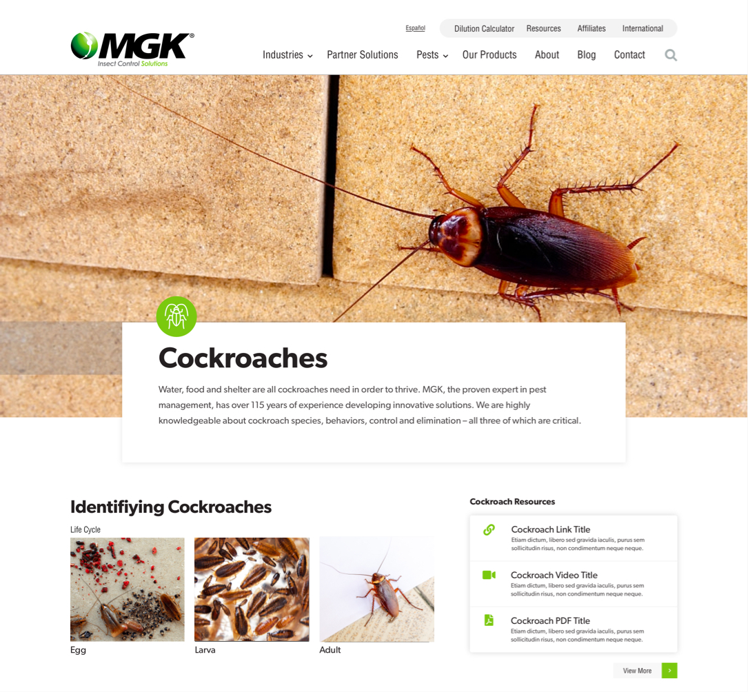
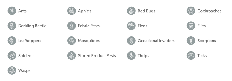
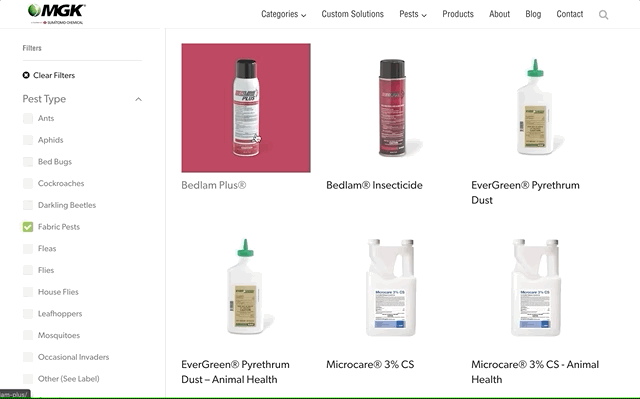
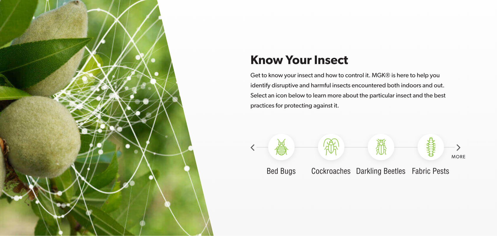
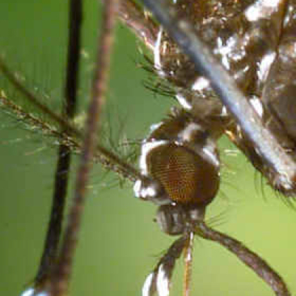
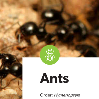
“Know Your Insect”
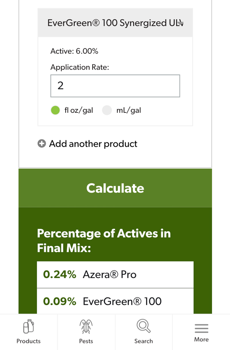
While there is a lot of functionality and intentional design baked into the website, by far the largest initiative of the site was to turn MGK into the defacto insect control resource online. We did this through creating a pest library and linking the pest library entries as much as we can to other areas on the site. This would encourage exploration and ultimately lead to lead conversion pages.